CAS(E) this Sketch #284 is a retro one from teammie Sam.
Here's my simplified take on it back in May 2014.
And here's what I came up with in 2018--another simplified take.
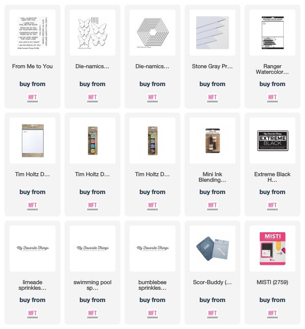
A butterfly was ink distressed with two colors and spattered lightly with water.
A hexagon shape was cut from wood grain card stock and adhered to a Stone
Gray card base. The butterfly was adhered to the hexagon shape and the
sentiment was stamped on the bottom. Enamel dots finished off the card.
Visit CAS(E) this Sketch to see how the rest of the team interpreted the sketch
and join us if you can. Link up your card(s) by Thursday, August 16th and as
the weekly winner, you'll be invited to guest with us on a future sketch!


Great design ideas! Thank you for the suggestions.
ReplyDeleteOh how lovely!! I love the differences from the first time!!
ReplyDeleteBeautiful! Both of these are wonderful!
ReplyDeleteThe owl version is pretty, but I love the butterfly one! It's so elegant and sophisticated. Love the fresh color combo (Gray with Greens)! Hideko xx
ReplyDeleteHow FUN!
ReplyDeleteDelightful cards, Donna. Especially like the second one. tfs
ReplyDeleteLike how you used the sketch each time. The first one incorporated the same layout but a different shape to make it your own and the more recent one follows the sketch more closely. Both are lovely!
ReplyDeleteGorgeous take on the sketch...x2, Donna!!! I love the sleepy owl and really, really love your beautiful ink blended butterfly!
ReplyDelete